Python renderer for the OpenDisplay Language (ODL).
odl-renderer is a standalone Python library for generating images from ODL drawing instructions. Originally extracted from the OpenEPaperLink Home Assistant integration, it provides a clean, async API for rendering text, shapes, icons, QR codes, and more to PIL images.
- Pure Rendering: No dependencies on Home Assistant or other frameworks
- 17 Element Types: Text, shapes, icons, QR codes, images, progress bars, and more
- Async/Await: Modern async API for efficient image generation
- Flexible Input: Accepts fonts as PIL objects, file paths, or built-in names
- Full Color Output: Returns PIL Image objects in full RGB/RGBA (caller handles dithering)
- Percentage-Based Coordinates: Position elements using percentages or absolute pixels
- Template-Ready: All values are plain data (templates expanded by caller)
uv add odl-renderer
# or
pip install odl-rendererimport asyncio
from odl_renderer import generate_image
async def main():
image = await generate_image(
width=296,
height=128,
elements=[
{
"type": "text",
"value": "Hello World",
"x": "50%",
"y": 50,
"font": "ppb",
"size": 24,
"color": "black",
"anchor": "mm",
},
{
"type": "rectangle",
"x_start": 10,
"y_start": 10,
"x_end": 100,
"y_end": 50,
"fill": "red",
"outline": "black",
"width": 2,
},
],
background="white",
accent_color="red",
)
image.save("output.png")
asyncio.run(main())| Category | Types |
|---|---|
| Text | text, multiline |
| Shapes | rectangle, rectangle_pattern, circle, ellipse, polygon, arc, line |
| Icons | icon, icon_sequence |
| Media | dlimg, qrcode |
| Visualizations | progress_bar, plot, diagram |
| Debug | debug_grid |
| Value | Description |
|---|---|
"black" / "b" |
Black |
"white" / "w" |
White |
"red" / "r" |
Red |
"yellow" / "y" |
Yellow |
"blue" / "bl" |
Blue |
"green" / "gr" / "g" |
Green |
"gray" / "grey" |
Mid-gray |
"half_black" / "hb" |
Half-tone black |
"half_red" / "hr" |
Half-tone red |
"half_yellow" / "hy" |
Half-tone yellow |
"accent" / "a" |
Accent color (configured via accent_color param) |
"half_accent" / "ha" |
Half-tone accent |
"#RGB" / "#RRGGBB" |
Hex color |
Coordinates accept either absolute integers (10, 256) or percentage strings ("50%", "100%").
When y is omitted, elements stack automatically: each element is placed below the previous one using pos_y + y_padding (default padding: 10px).
Used by text, icon, and icon_sequence to set which point of the element aligns to the given x/y coordinates.
text uses PIL anchor format — horizontal axis first, then vertical:
| Code | Meaning |
|---|---|
lt |
Left-top |
mt |
Middle-top |
rt |
Right-top |
lm |
Left-middle |
mm |
Middle (center) |
rm |
Right-middle |
lb |
Left-bottom |
mb |
Middle-bottom |
rb |
Right-bottom |
icon and icon_sequence use a different format for corner anchors — vertical axis first:
| Code | Meaning |
|---|---|
tl |
Top-left |
tr |
Top-right |
mt |
Middle-top |
lm |
Left-middle |
mm |
Middle (center) |
rm |
Right-middle |
bl |
Bottom-left |
br |
Bottom-right |
mb |
Middle-bottom |
Every element type accepts an optional visible field. When false, the element is skipped entirely (no rendering, no position update). Defaults to true.
{
    "type": "text",
    "value": "Hidden",
    "x": 10,
    "y": 10,
    "visible": False
}Single-line text with optional wrapping, truncation, stroke, and inline color markup.
| Field | Required | Default | Notes |
|---|---|---|---|
value |
yes | — | Text content |
x |
yes | — | X position |
y |
no | auto | Y position; auto-stacks if omitted |
font |
no | "ppb" |
Built-in name ("ppb", "rbm"), file path, or PIL Font object |
size |
no | 20 |
Font size in pixels |
color |
no | "black" |
Text color |
anchor |
no | "lt" / "la" |
Anchor point; defaults to "la" when text wraps to multiple lines |
max_width |
no | — | Wrap text at this pixel width |
truncate |
no | false |
Truncate with … instead of wrapping |
align |
no | "left" |
"left", "center", or "right" |
spacing |
no | 5 |
Line spacing when wrapped |
stroke_width |
no | 0 |
Outline width |
stroke_fill |
no | "white" |
Outline color |
parse_colors |
no | false |
Enable [red]text[/red] inline color markup |
y_padding |
no | 10 |
Extra space above when auto-stacking |
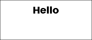
{
    "type": "text",
    "value": "Hello",
    "x": "50%",
    "y": 20,
    "size": 32,
    "anchor": "mt",
}
Inline color markup (requires parse_colors: true): wrap text in [color]...[/color] tags. Accepts all named colors, short names, and hex ([#ff0000]red text[/#ff0000]).
Fixed-line text split by a delimiter, each line placed at a fixed vertical offset.
| Field | Required | Default | Notes |
|---|---|---|---|
value |
yes | — | Full text content |
x |
yes | — | X position |
delimiter |
yes | — | Character used to split lines (e.g. "|") |
offset_y |
yes | — | Pixels between each line |
y |
no | auto | Y of first line |
font |
no | "ppb" |
Font |
size |
no | 20 |
Font size |
color |
no | "black" |
Text color |
anchor |
no | "lm" |
Anchor point |
align |
no | "left" |
Text alignment |
stroke_width |
no | 0 |
Outline width |
stroke_fill |
no | "white" |
Outline color |
parse_colors |
no | false |
Inline color markup |
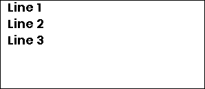
{
    "type": "multiline",
    "value": "Line 1|Line 2|Line 3",
    "x": 10,
    "y": 10,
    "delimiter": "|",
    "offset_y": 24,
    "size": 18,
}
Rectangle with optional fill, outline, and rounded corners.
| Field | Required | Default | Notes |
|---|---|---|---|
x_start |
yes | — | Left edge |
y_start |
yes | — | Top edge |
x_end |
yes | — | Right edge |
y_end |
yes | — | Bottom edge |
fill |
no | — | Fill color |
outline |
no | "black" |
Border color |
width |
no | 1 |
Border width |
corners |
no | — | Which corners to round: "all", "top_left", "top_right", "bottom_left", "bottom_right" (comma-separated) |
radius |
no | 10 |
Corner radius; only applies when corners is set |
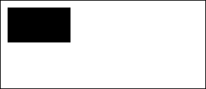
{
    "type": "rectangle",
    "x_start": 10,
    "y_start": 10,
    "x_end": 100,
    "y_end": 60,
    "fill": "black",
}
Repeating grid of rectangles — useful for dot matrices, grids, and decorative patterns.
| Field | Required | Default | Notes |
|---|---|---|---|
x_start |
yes | — | Starting X |
y_start |
yes | — | Starting Y |
x_size |
yes | — | Width of each rectangle |
y_size |
yes | — | Height of each rectangle |
x_repeat |
yes | — | Number of columns |
y_repeat |
yes | — | Number of rows |
x_offset |
yes | — | Horizontal gap between rectangles |
y_offset |
yes | — | Vertical gap between rectangles |
fill |
no | — | Fill color |
outline |
no | "black" |
Border color |
width |
no | 1 |
Border width |
corners / radius |
no | — | Same as rectangle |
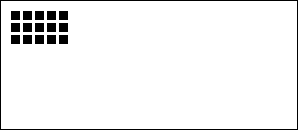
{
    "type": "rectangle_pattern",
    "x_start": 10,
    "y_start": 10,
    "x_size": 8,
    "y_size": 8,
    "x_repeat": 5,
    "y_repeat": 3,
    "x_offset": 4,
    "y_offset": 4,
    "fill": "black",
}
Circle defined by center point and radius.
| Field | Required | Default | Notes |
|---|---|---|---|
x |
yes | — | Center X |
y |
yes | — | Center Y |
radius |
yes | — | Radius in pixels |
fill |
no | — | Fill color |
outline |
no | "black" |
Border color |
width |
no | 1 |
Border width |
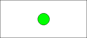
{
    "type": "circle",
    "x": "50%",
    "y": "50%",
    "radius": 20,
    "fill": "green",
    "outline": "black",
}
Ellipse defined by a bounding box.
| Field | Required | Default | Notes |
|---|---|---|---|
x_start |
yes | — | Left edge |
y_start |
yes | — | Top edge |
x_end |
yes | — | Right edge |
y_end |
yes | — | Bottom edge |
fill |
no | — | Fill color |
outline |
no | "black" |
Border color |
width |
no | 1 |
Border width |
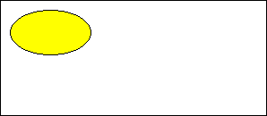
{
    "type": "ellipse",
    "x_start": 10,
    "y_start": 10,
    "x_end": 100,
    "y_end": 60,
    "fill": "yellow",
}
Arbitrary polygon defined by a list of vertices.
| Field | Required | Default | Notes |
|---|---|---|---|
points |
yes | — | List of [x, y] pairs |
fill |
no | — | Fill color |
outline |
no | "black" |
Border color |
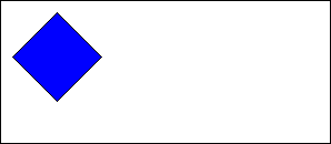
{
    "type": "polygon",
    "points": [[10, 50], [50, 10], [90, 50], [50, 90]],
    "fill": "blue",
}
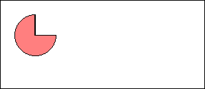
Arc or pie slice defined by center, radius, and angle range.
| Field | Required | Default | Notes |
|---|---|---|---|
x |
yes | — | Center X |
y |
yes | — | Center Y |
radius |
yes | — | Radius in pixels |
start_angle |
yes | — | Start angle in degrees (0 = right, counter-clockwise) |
end_angle |
yes | — | End angle in degrees |
fill |
no | — | Fill color (creates a pie slice) |
outline |
no | "black" |
Border color |
width |
no | 1 |
Border width |
{
    "type": "arc",
    "x": 50,
    "y": 50,
    "radius": 30,
    "start_angle": 0,
    "end_angle": 270,
    "outline": "black",
    "fill": "half_red",
}
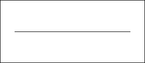
Straight line between two points with optional dashing.
| Field | Required | Default | Notes |
|---|---|---|---|
x_start |
yes | — | Start X |
x_end |
yes | — | End X |
y_start |
no | auto | Start Y |
y_end |
no | y_start |
End Y (horizontal line if omitted) |
fill |
no | "black" |
Line color |
width |
no | 1 |
Line width |
dashed |
no | false |
Enable dashed style |
dash_length |
no | 5 |
Length of each dash |
space_length |
no | 3 |
Gap between dashes |
{
    "type": "line",
    "x_start": "10%",
    "y_start": "50%",
    "x_end": "90%",
    "y_end": "50%",
    "fill": "black",
}
Icons use the bundled Material Design Icons font (7,000+ icons). Pass the icon name with or without the mdi: prefix.
Single MDI icon.
| Field | Required | Default | Notes |
|---|---|---|---|
value |
yes | — | Icon name, e.g. "home" or "mdi:home" |
x |
yes | — | X position |
y |
yes | — | Y position |
size |
yes | — | Icon size in pixels |
color |
no | "black" |
Icon color |
anchor |
no | "mm" |
Anchor point |
{
    "type": "icon",
    "value": "mdi:thermometer",
    "x": "50%",
    "y": "50%",
    "size": 48,
    "anchor": "mm",
}
Row or column of MDI icons.
| Field | Required | Default | Notes |
|---|---|---|---|
icons |
yes | — | List of icon names |
x |
yes | — | Starting X |
y |
yes | — | Starting Y |
size |
yes | — | Icon size in pixels |
direction |
no | "right" |
"right", "left", "up", or "down" |
spacing |
no | size / 4 |
Gap between icons |
color |
no | "black" |
Icon color |
anchor |
no | "mm" |
Anchor point |
{
    "type": "icon_sequence",
    "icons": ["mdi:weather-sunny", "mdi:weather-cloudy", "mdi:weather-rainy"],
    "x": 20,
    "y": 20,
    "size": 32,
}
Image from a URL, file path, data URI, bytes, or PIL Image object. Resized to fit the specified dimensions.
Note: Entity IDs are not resolved — the caller must pass a URL, file path, or image object directly.
| Field | Required | Default | Notes |
|---|---|---|---|
url |
yes | — | Source: HTTP URL, file path, data URI, bytes, or PIL.Image |
x |
yes | — | X position |
y |
yes | — | Y position |
xsize |
yes | — | Target width |
ysize |
yes | — | Target height |
rotate |
no | 0 |
Rotation in degrees |
resize_method |
no | "stretch" |
"stretch", "crop", "cover", or "contain" |
{
    "type": "dlimg",
    "url": "https://picsum.photos/seed/odl/200/150",
    "x": 0,
    "y": 0,
    "xsize": 200,
    "ysize": 150,
    "resize_method": "cover",
}
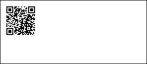
QR code generated from any text or URL.
| Field | Required | Default | Notes |
|---|---|---|---|
data |
yes | — | QR code content |
x |
yes | — | X position |
y |
yes | — | Y position |
color |
no | "black" |
Foreground color |
bgcolor |
no | "white" |
Background color |
border |
no | 1 |
Quiet zone size in modules |
boxsize |
no | 2 |
Pixel size of each module |
{
    "type": "qrcode",
    "data": "https://opendisplay.org",
    "x": 10,
    "y": 10,
}
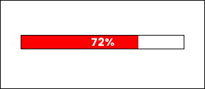
Horizontal or vertical progress bar with optional percentage label.
| Field | Required | Default | Notes |
|---|---|---|---|
x_start |
yes | — | Left edge |
y_start |
yes | — | Top edge |
x_end |
yes | — | Right edge |
y_end |
yes | — | Bottom edge |
progress |
yes | — | Fill level 0–100 (clamped automatically) |
direction |
no | "right" |
"right", "left", "up", or "down" |
fill |
no | "red" |
Progress fill color |
background |
no | "white" |
Empty track color |
outline |
no | "black" |
Border color |
width |
no | 1 |
Border width |
show_percentage |
no | false |
Overlay percentage text |
font_name |
no | "ppb" |
Font for percentage text |
{
    "type": "progress_bar",
    "x_start": "10%",
    "y_start": 50,
    "x_end": "90%",
    "y_end": 70,
    "progress": 72,
    "fill": "accent",
    "show_percentage": True,
}
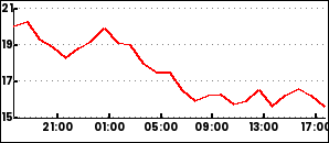
Time-series line chart with configurable axes, grid, and legends. Requires a DataProvider in the drawing context to supply historical data.
| Field | Required | Default | Notes |
|---|---|---|---|
data |
yes | — | List of series configs (see below) |
x_start |
no | 0 |
Chart left edge |
y_start |
no | 0 |
Chart top edge |
x_end |
no | image width | Chart right edge |
y_end |
no | image height | Chart bottom edge |
duration |
no | 86400 |
Time window in seconds |
low / high |
no | auto | Y-axis range override |
font |
no | "ppb" |
Font for labels |
Series, axis, and legend options
Each series in data:
| Field | Default | Notes |
|---|---|---|
entity |
required | Data source identifier passed to DataProvider |
color |
required | Line color |
width |
2 |
Line width |
smooth |
false |
Smooth the line |
line_style |
"solid" |
"solid", "dashed", or "dotted" |
show_points |
false |
Draw data points |
span_gaps |
false |
Connect across missing values |
yaxis (optional dict):
| Field | Default |
|---|---|
tick_every |
required |
color |
"black" |
grid |
true |
grid_style |
"dotted" |
xaxis (optional dict):
| Field | Default |
|---|---|
color |
"black" |
grid |
true |
grid_style |
"dotted" |
ylegend (optional dict):
| Field | Default |
|---|---|
position |
"left" |
size |
10 |
color |
"black" |
xlegend (optional dict):
| Field | Default |
|---|---|
interval |
required |
format |
"%H:%M" |
position |
"bottom" |
size |
10 |
snap_to_hours |
true |
{
  "type": "plot",
  "x_start": 0,
  "y_start": 6,
  "x_end": 292,
  "y_end": 120,
  "round_values": True,
  "data":
    [
      {
        "entity": "sensor.temperature",
        "color": "red",
        "width": 2
      }
    ],
  "yaxis":
    {
      "tick_every": 2,
      "grid_color": "gray"
    },
  "ylegend":
    {
      "position": "left"
    },
  "xaxis":
    {
      "color": "black",
      "grid": False
    },
  "xlegend":
    {
      "interval": 14400
    }
}
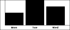
Simple bar chart with labeled axes.
| Field | Required | Default | Notes |
|---|---|---|---|
x |
yes | — | X position |
height |
yes | — | Diagram height |
width |
no | image width | Diagram width |
margin |
no | 20 |
Margin from edges |
bars |
no | — | Bar chart config (see below) |
bars config:
| Field | Notes |
|---|---|
values |
Semicolon-separated "label,value" pairs: "Mon,10;Tue,20;Wed,15" |
color |
Bar fill color |
font |
Font name |
legend_size |
Label font size |
legend_color |
Label color |
{
    "type": "diagram",
    "x": 0,
    "height": 128,
    "bars": {
        "values": "Mon,10;Tue,20;Wed,15",
        "color": "black",
    },
}
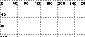
Renders a coordinate grid over the image. Useful during layout development.
| Field | Required | Default | Notes |
|---|---|---|---|
spacing |
no | 20 |
Grid cell size in pixels |
line_color |
no | "black" |
Grid line color |
dashed |
no | true |
Use dashed lines |
dash_length |
no | 2 |
Dash segment length |
space_length |
no | 4 |
Gap between dashes |
show_labels |
no | true |
Show coordinate labels |
label_step |
no | spacing * 2 |
Interval between labels |
label_color |
no | "black" |
Label color |
label_font_size |
no | 12 |
Label font size |
font |
no | "ppb" |
Font for labels |
{
    "type": "debug_grid",
    "spacing": 20,
    "line_color": "gray",
}